Psychology of Color in Web Design: Choose Your Brand Palette

Why Color Psychology Matters in Web Design
When visitors land on your website, they form an opinion within milliseconds. While content and design structure play crucial roles, color is often the silent persuader that guides users toward action. Color psychology—the study of how colors influence human emotion and behavior—is fundamental to effective web design.
At Schiano Studios, we've seen firsthand how strategic color choices can increase engagement rates, improve brand recall, and even boost conversion rates. Colors trigger emotional responses before conscious thought kicks in. For example, red creates urgency and excitement, making it ideal for CTAs and sales promotions. Blue evokes trust and calm, which is why financial institutions and tech companies favor it. Purple suggests creativity and luxury, while green communicates growth and health.
The key is understanding your audience and aligning your color palette with both your brand identity and user expectations. A wellness brand using aggressive red might confuse customers, just as a luxury brand using bright yellow might seem inexpensive. Your color choices should tell a cohesive story.
The Impact of Color on User Behavior
Color directly influences how users navigate your site and whether they complete desired actions. Studies show that color increases brand recognition by up to 80% and improves reading comprehension by 73%. This isn't coincidental—it's rooted in how our brains process visual information.
When you establish a consistent color palette across your website, users develop visual familiarity. Buttons in a specific color become associated with action. Navigation elements in another shade stand out naturally. This consistency reduces cognitive load and makes your site feel more intuitive.
Consider contrast, too. High contrast between text and background improves readability and accessibility—essential for users with visual impairments. A navy text on a light gray background might look elegant but could be difficult for many users to read. Testing color combinations for both aesthetics and accessibility ensures your design is both beautiful and functional.
The psychology of color also extends to cultural differences. While white symbolizes purity in Western cultures, it represents mourning in some Asian traditions. If your brand operates globally, understanding these nuances prevents missteps and ensures your color choices resonate across demographics.
Choosing Your Brand Color Palette: A Strategic Framework
Selecting the right color palette requires more than personal preference—it demands strategy. Start by defining your brand personality. Are you innovative, trustworthy, playful, or sophisticated? Your colors should visually communicate these traits to your audience instantly.
Next, identify your primary color—the one that will dominate your design and become most synonymous with your brand. This is your signature color, the one users will recognize across all touchpoints. Then, choose 2-3 secondary colors that complement and support your primary without competing for attention. Finally, select neutral colors (like grays or whites) for backgrounds and text to create balance and readability.
Use color theory principles like the 60-30-10 rule: allocate 60% of your design to your primary color, 30% to secondary colors, and 10% to accent colors that draw attention to important elements like CTAs. This proportion feels harmonious and guides user focus naturally.
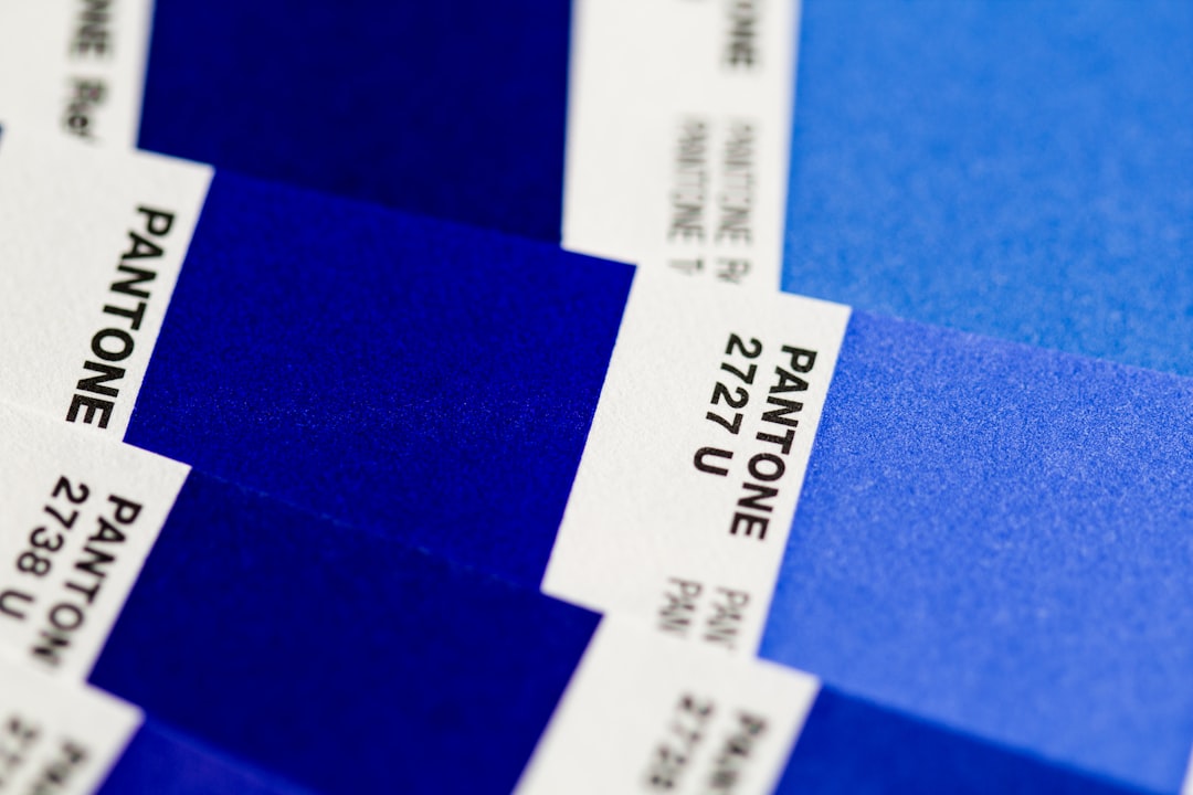
Tools like Adobe Color, Coolors, or Color Hunt help generate palette combinations, but the real work comes in testing. A/B test different color schemes with real users. Monitor how variations affect bounce rates, click-through rates, and conversions. What works for a SaaS platform might fail for an e-commerce store.
Best Practices for Web Color Implementation
Once you've chosen your palette, apply it consistently across every page and platform. This consistency strengthens brand identity and builds user trust. Update your design system documentation to specify exact hex codes, ensuring everyone on your team uses identical colors.
Consider accessibility standards like WCAG compliance. Aim for a contrast ratio of at least 4.5:1 for normal text and 3:1 for large text. Tools like WebAIM's contrast checker validate your color combinations are readable for everyone, including colorblind users.
Don't forget about how colors appear on different devices. Monitor colors look different on phones, tablets, and desktop screens due to varying display calibrations. Test your palette across devices to ensure your brand colors remain consistent and true.
Finally, remember that less is often more. A well-executed 3-4 color palette beats a chaotic rainbow every time. Restraint creates sophistication and makes your brand memorable. At Schiano Studios, we've built countless websites where strategic color choices became the foundation of successful user experiences and strong brand identities.